Dark Symbolic
Still Here
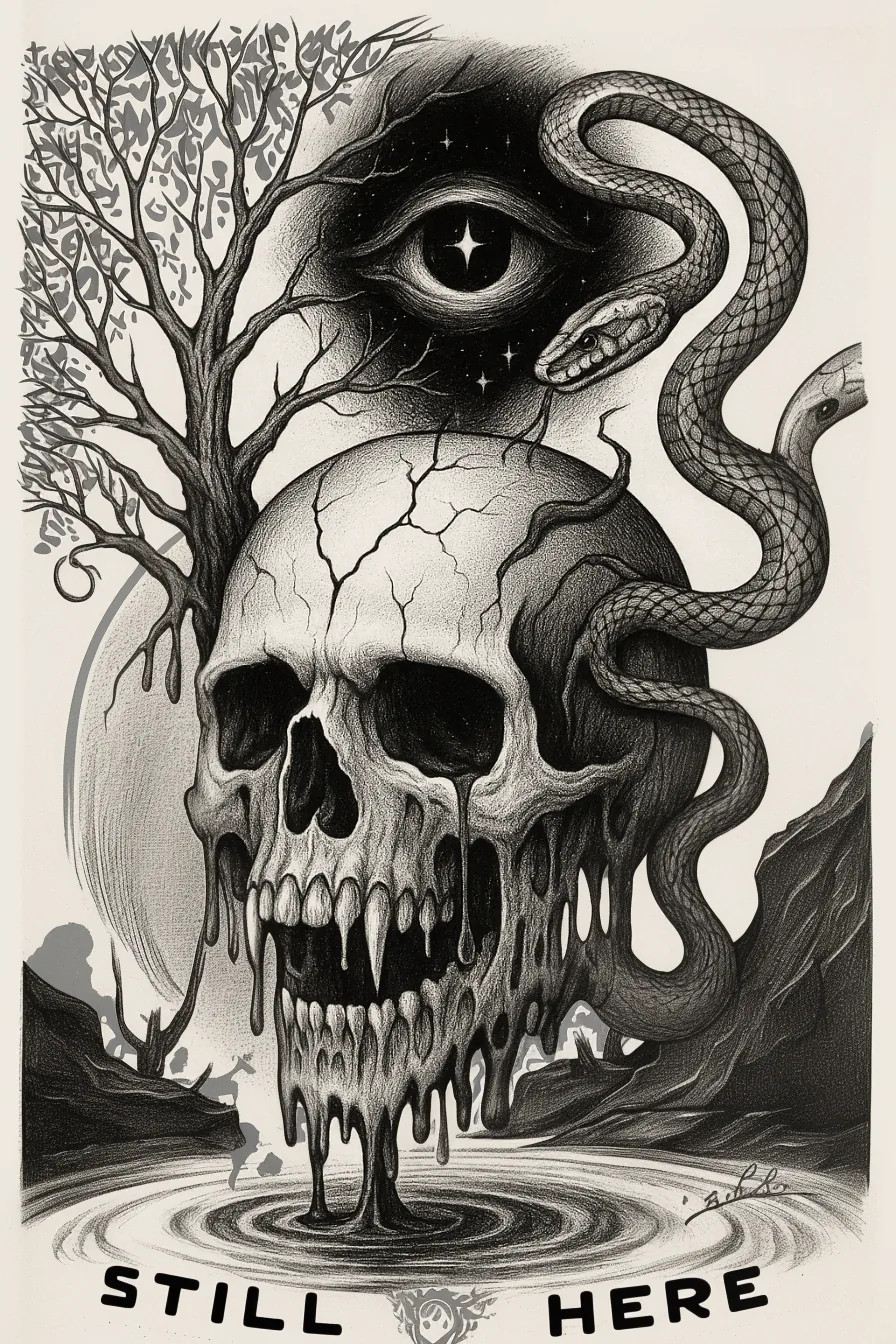
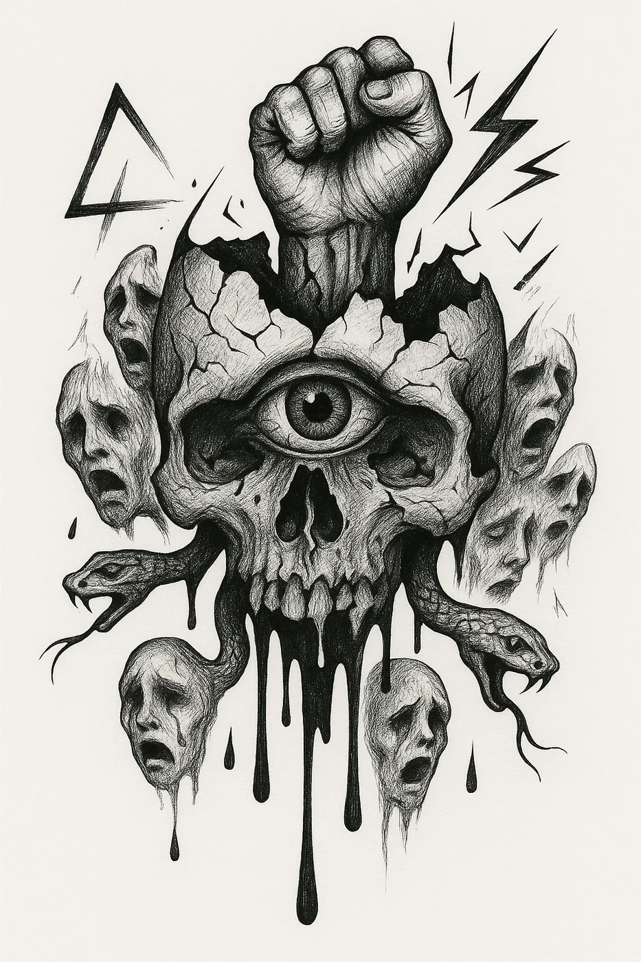
Skull poster with eye, snake, raised fist, and survival-based title treatment.
Original ink drawings, campaign design, identity work, forms, and visual system studies. Source work is not for sale — prints and editions are in the shop.
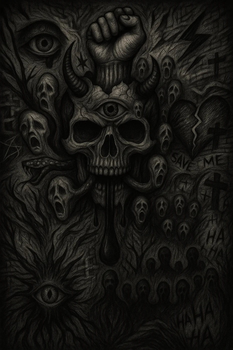
Original dark editorial work. Skull, eye, snake, and survival imagery from the Still Here series.
Skull poster with eye, snake, raised fist, and survival-based title treatment.
Title card from the Still Here series — dark typography and skull composition.
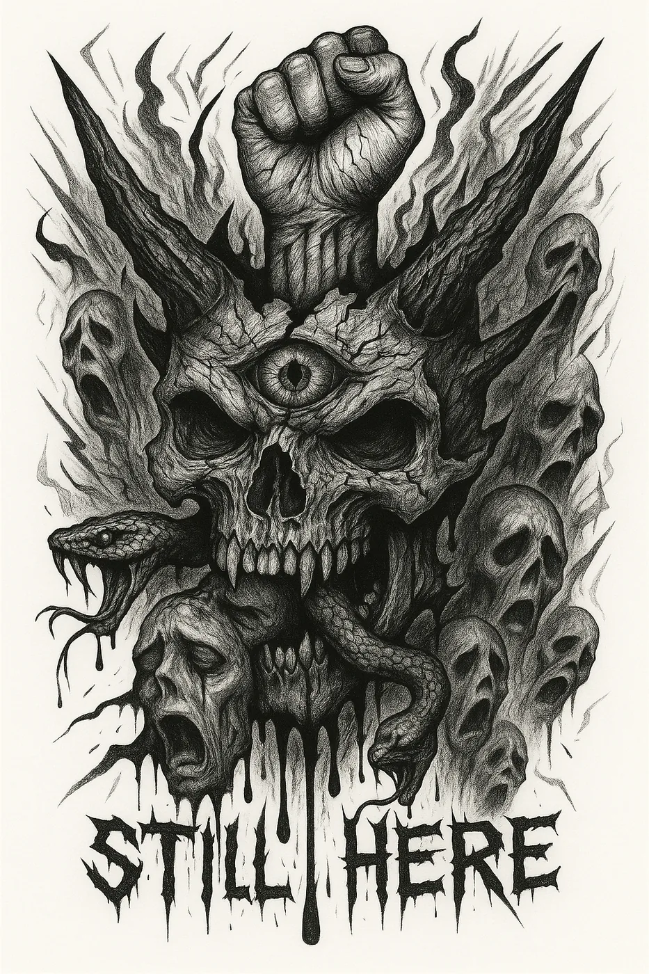
Skull collage composition — layered dark editorial series.
Clean line study from the horned skull experimental series.
Deconstructed skull study — dark experimental composition.
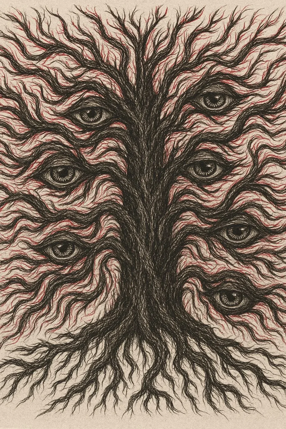
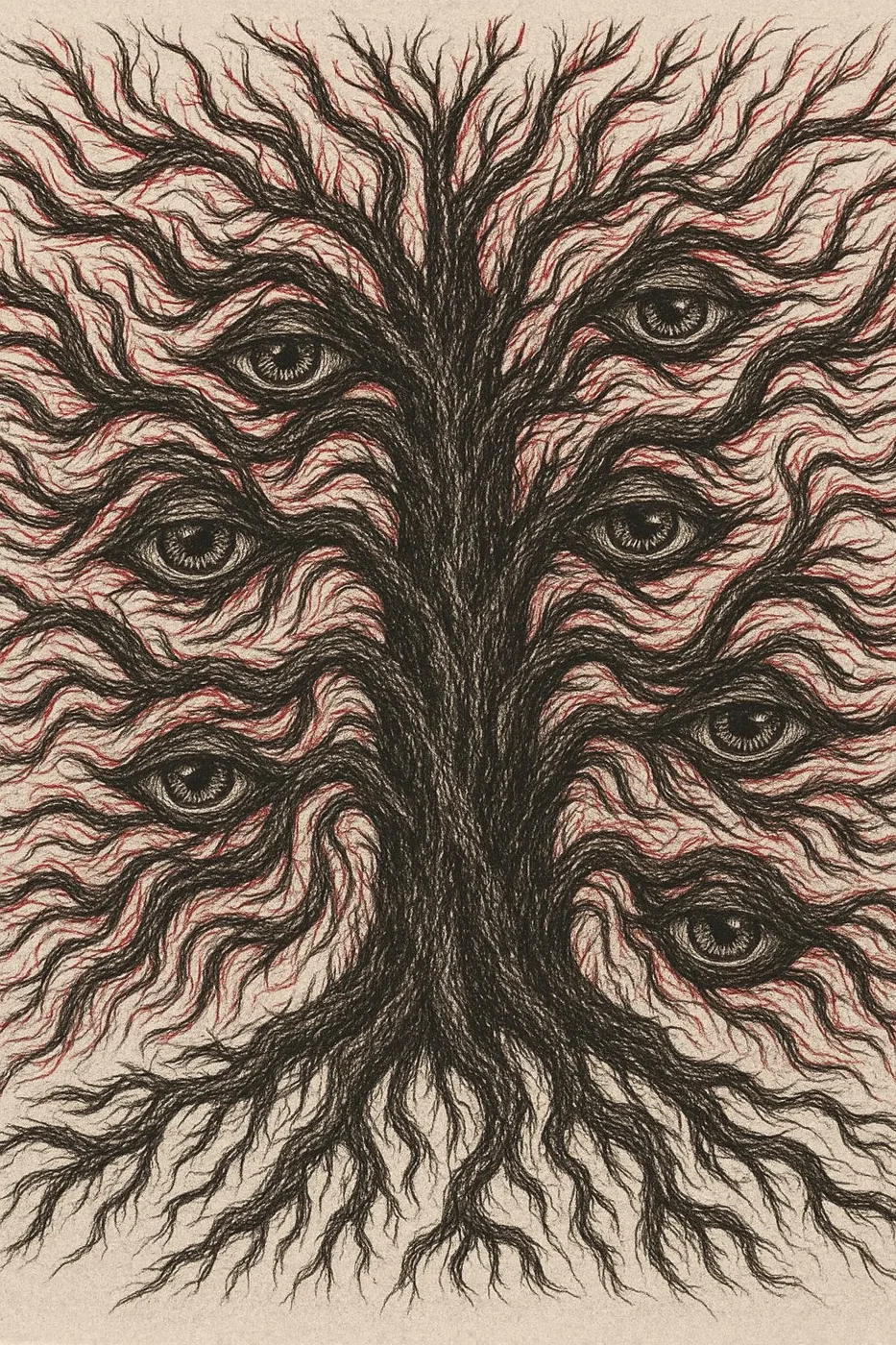
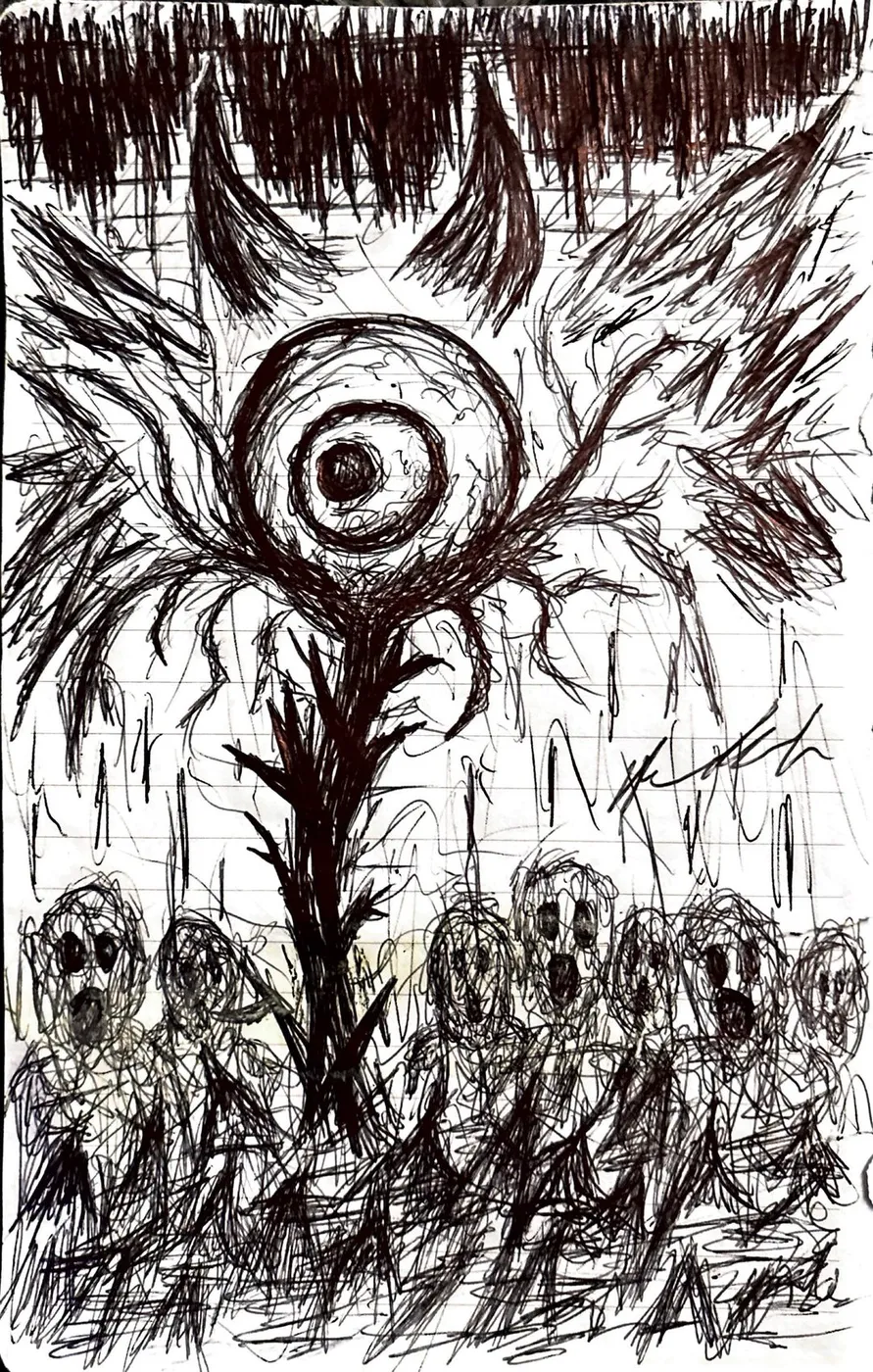
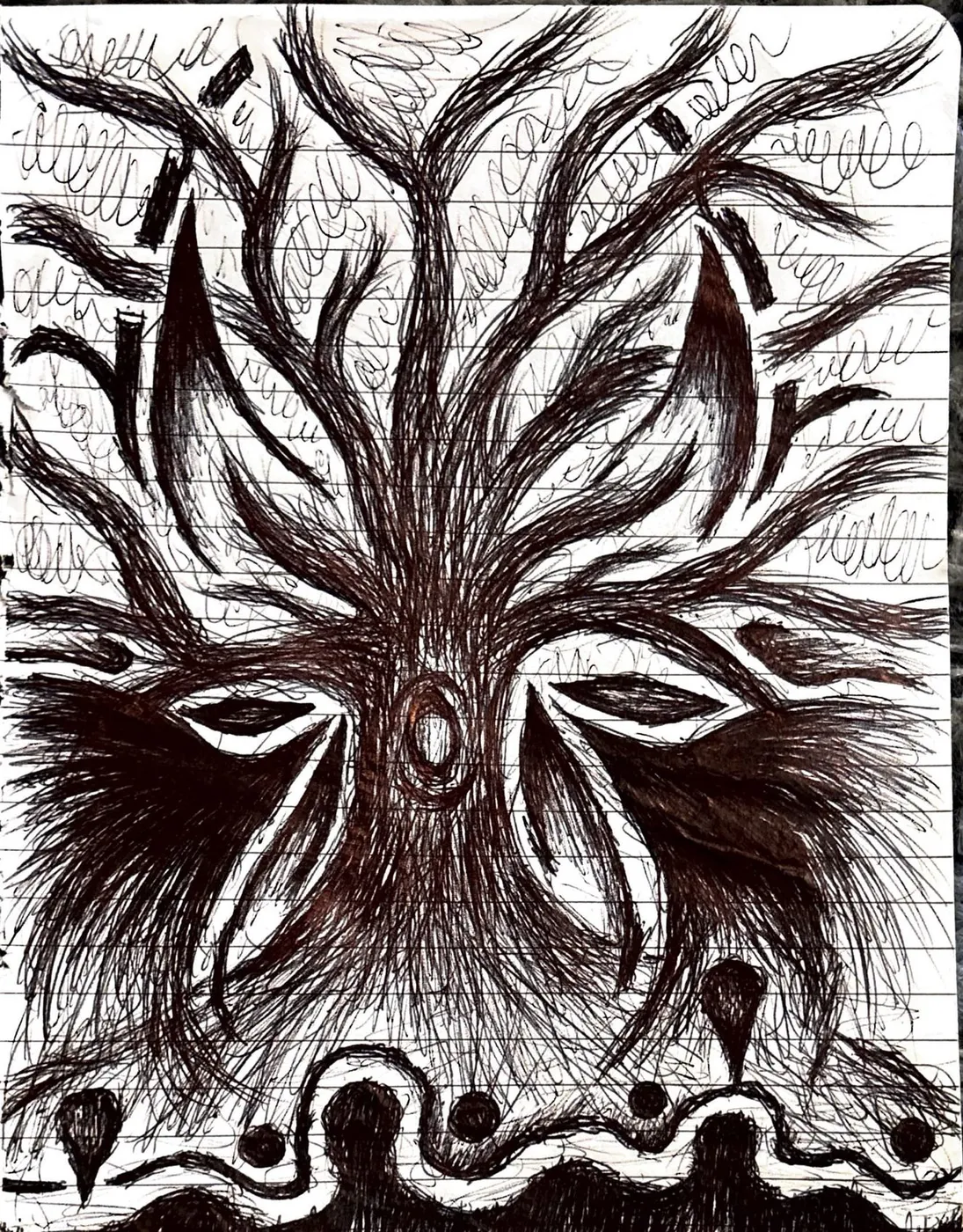
Eye-and-root symbolic system. Branching forms, red/black pressure, and recurring tree motifs.
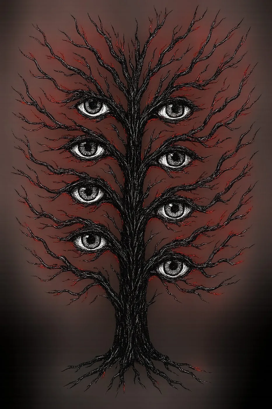
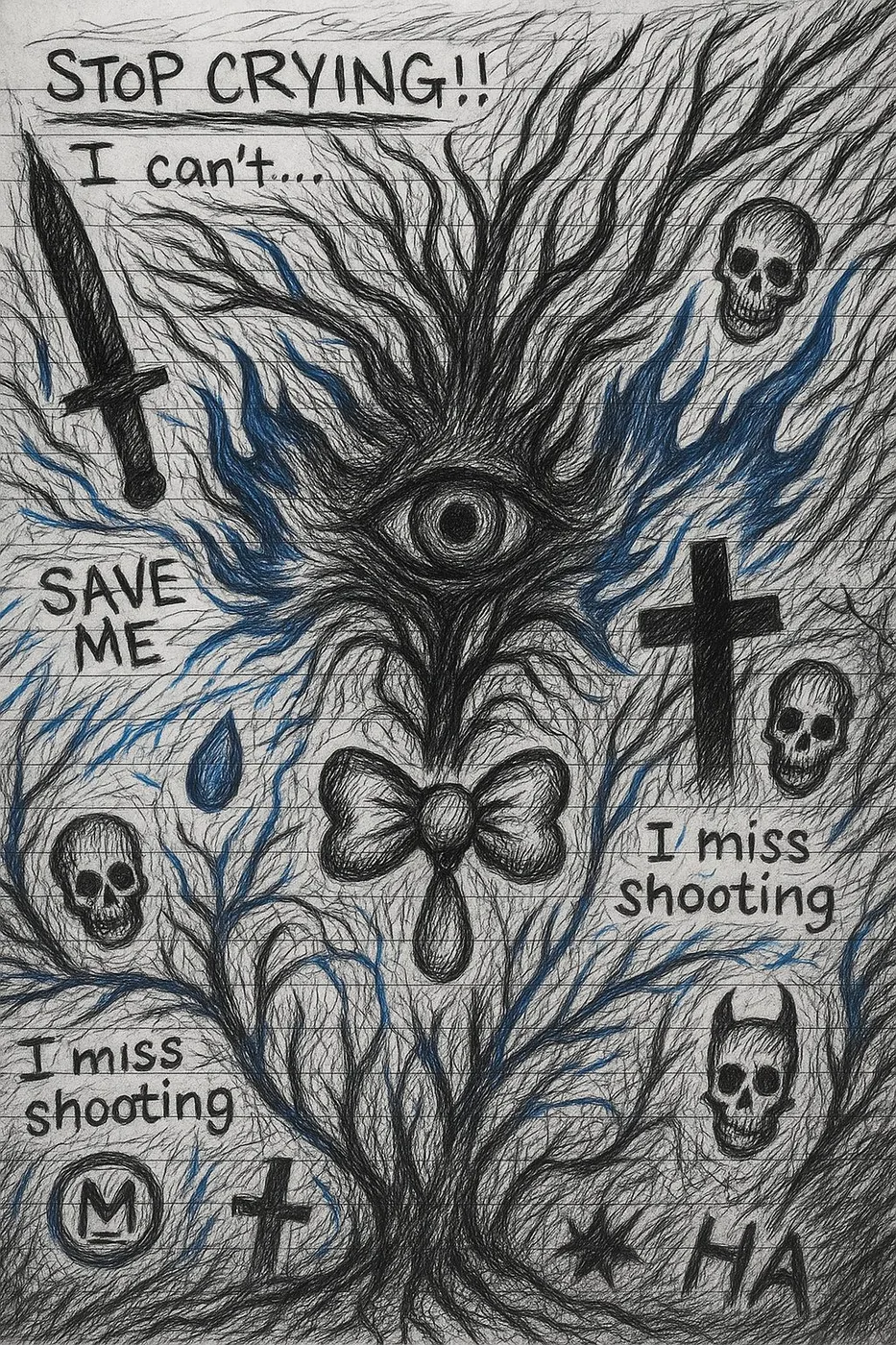
Finished eye-and-root composition using symmetry, branching forms, and red/black pressure as the core visual language.
More open tree-and-eye composition with full-body structure and negative space.
Close-up study of the eye-root symbolic system — red and black pressure marks.
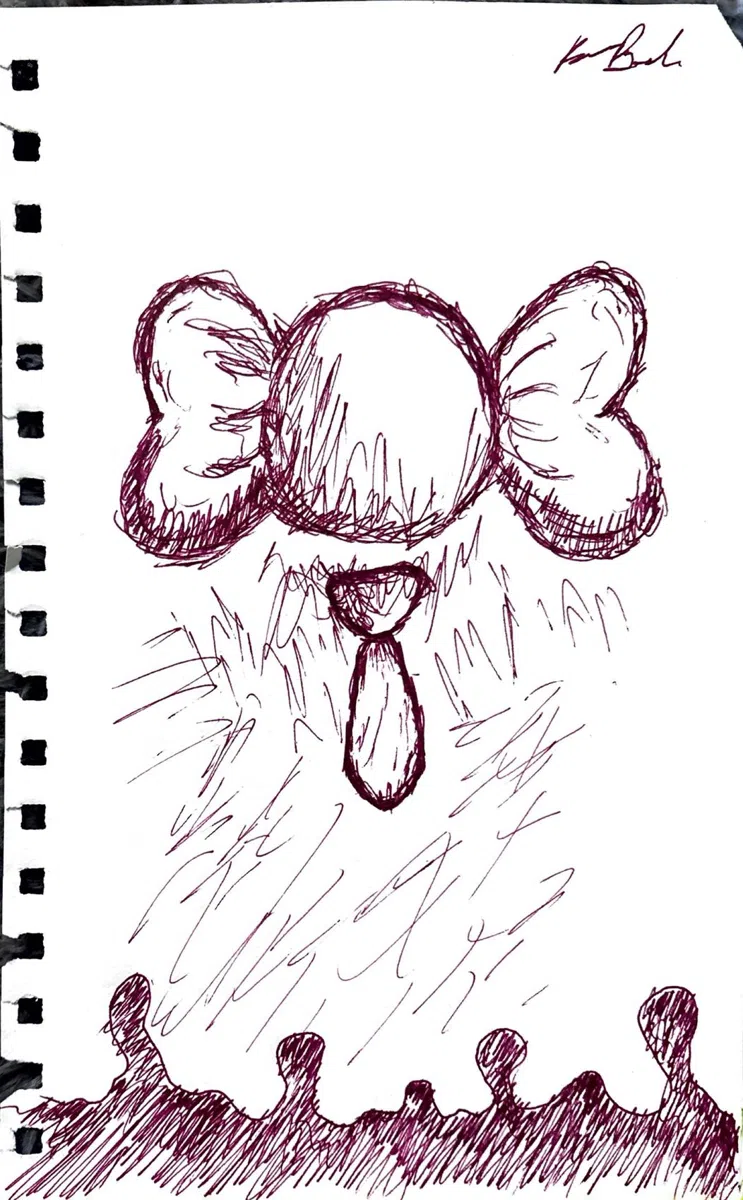
Symbolic sketchbook pages — eye clusters, butterflies, hearts, crosses, and handwritten marks.
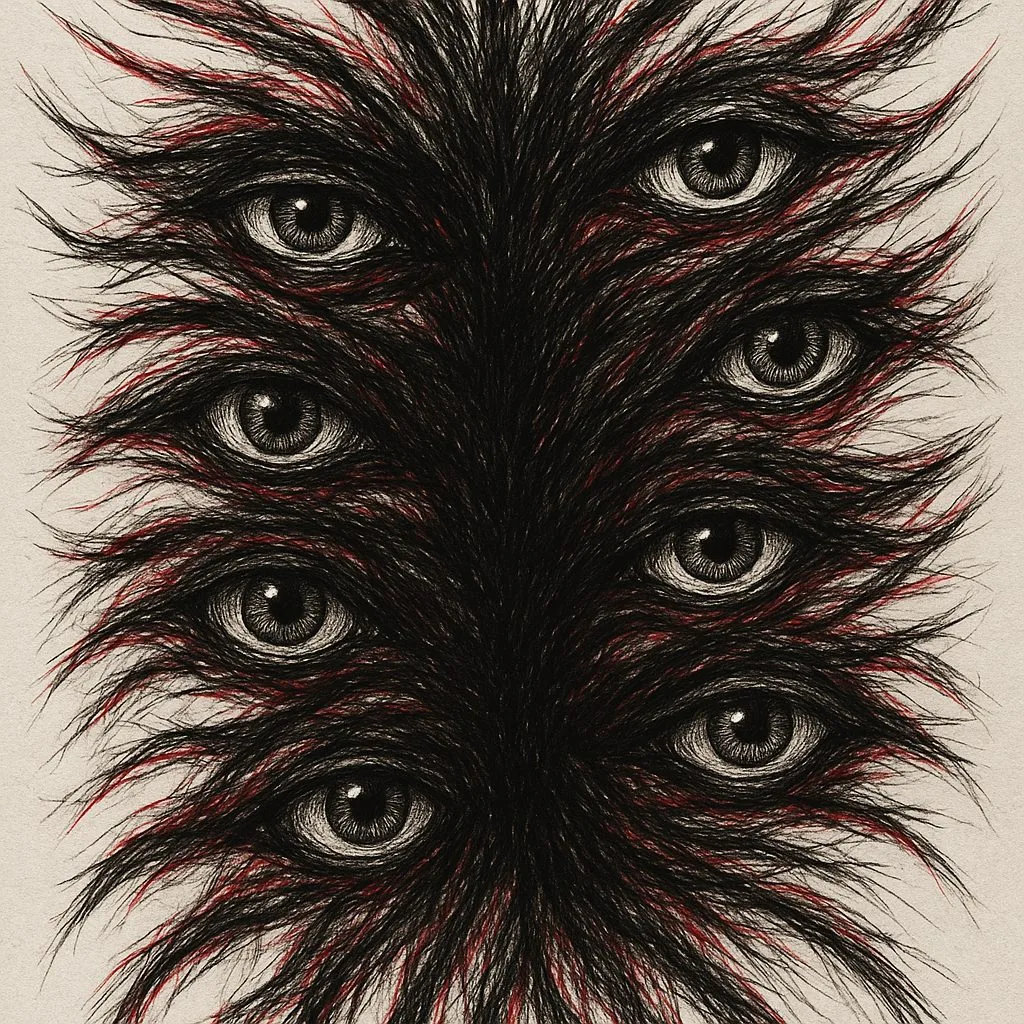
Dense eye-based piece built from repetition, symmetrical tension, and red underdrawing.
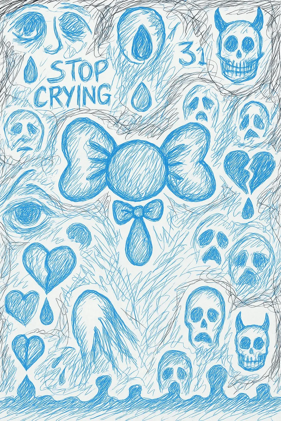
Blue-line symbolic page — skulls, tears, central bow/butterfly form, and grief iconography.
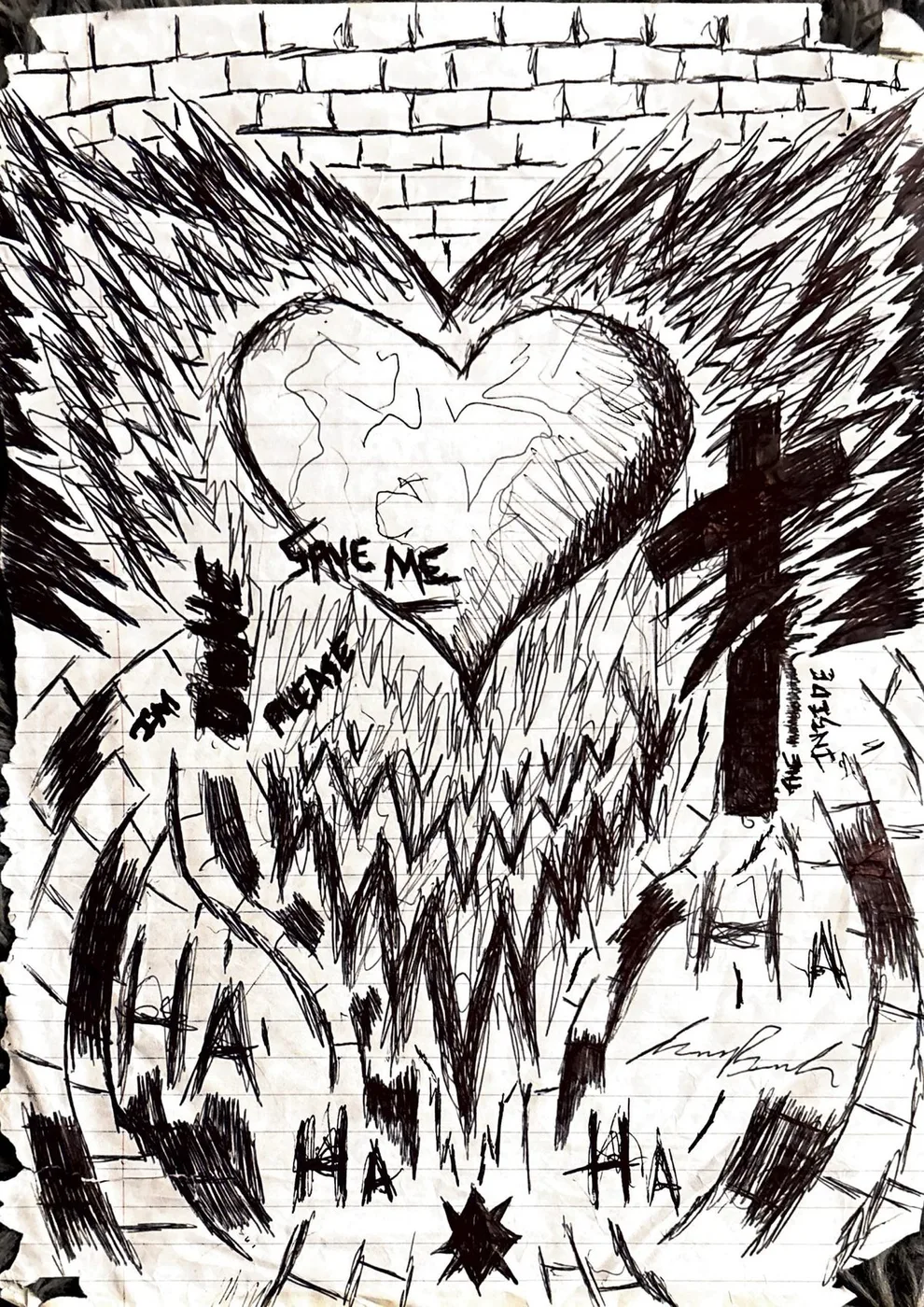
Original sketchbook page — hearts, crosses, handwritten marks, and distressed symbolic repetition.
Blue-toned symbolic page — text, gestural marks, and emotional symbol layering.
Logo development, mark studies, and brand identity work for R=Me.
The R-EqualsMe brand logo — primary mark.
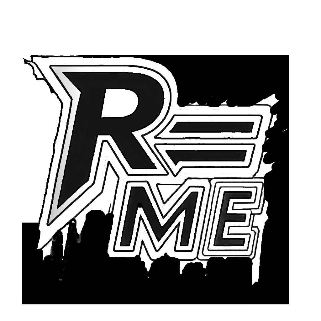
Refined R-EqualsMe mark showing the sharp-edged logo direction after sketch exploration.

Brand application concept — R=Me mark on a wallet product mockup.
Source drawings and original sketches. These are the physical works behind the refined pieces.
Hand-drawn sketchbook source behind the tree-and-eye refinements. Notebook texture and pressure marks preserved.
Original pencil sketch showing the source structure behind root-and-eye refinements.
Sketchbook study — central bow form, small figures, and root-like marks.
Sketchbook spread showing early R=Me logo development and mark exploration.
Brand identity, social posts, campaign posters, and event flyers for the Dare To Care home care initiative.
Polished logo direction — clean green palette with infinity symbol mark.
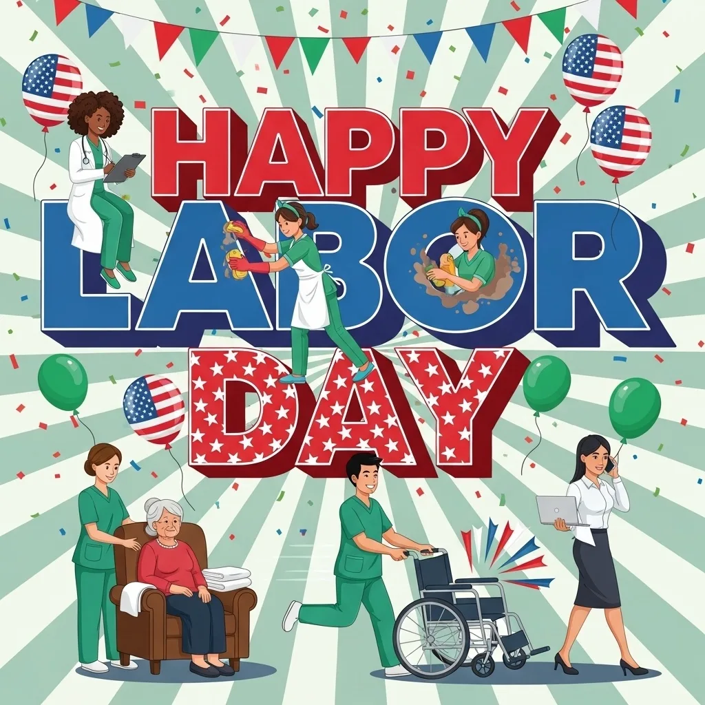
Original campaign design for the Dare To Care Labor Day post.
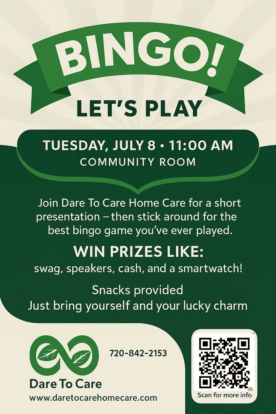
Event poster for the Dare To Care bingo night — community care campaign.
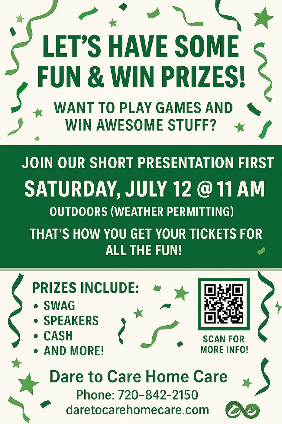
Event flyer for Dare To Care games and prizes night.
Dare To Care campaign poster — joyful community moment in poster format.
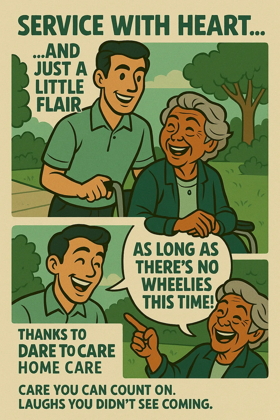
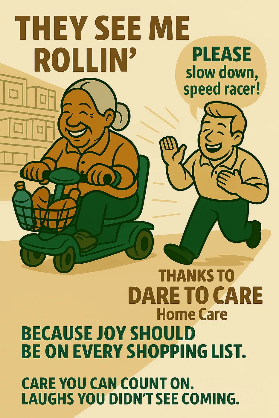
Comic-style campaign illustration for Dare To Care service messaging.
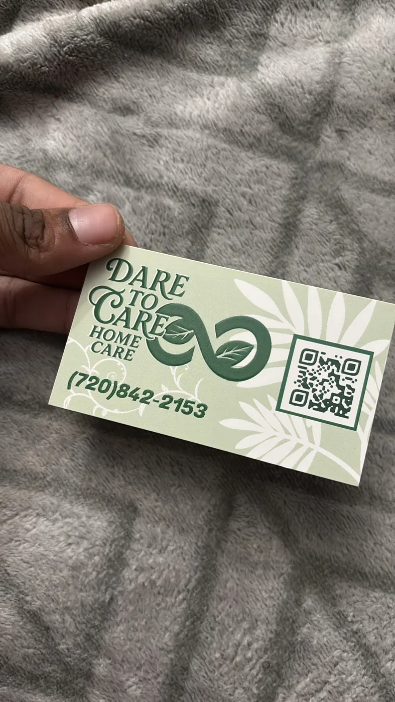
Physical business card for the Dare To Care brand — print-ready design.
Selected form excerpts showing information hierarchy, guided structure, and document design capability.
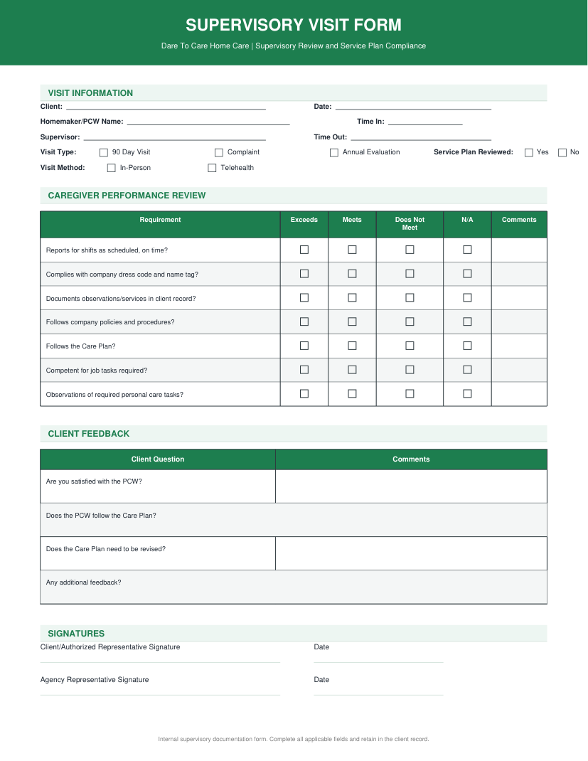
Structured form layout showing field hierarchy and guided entry design.
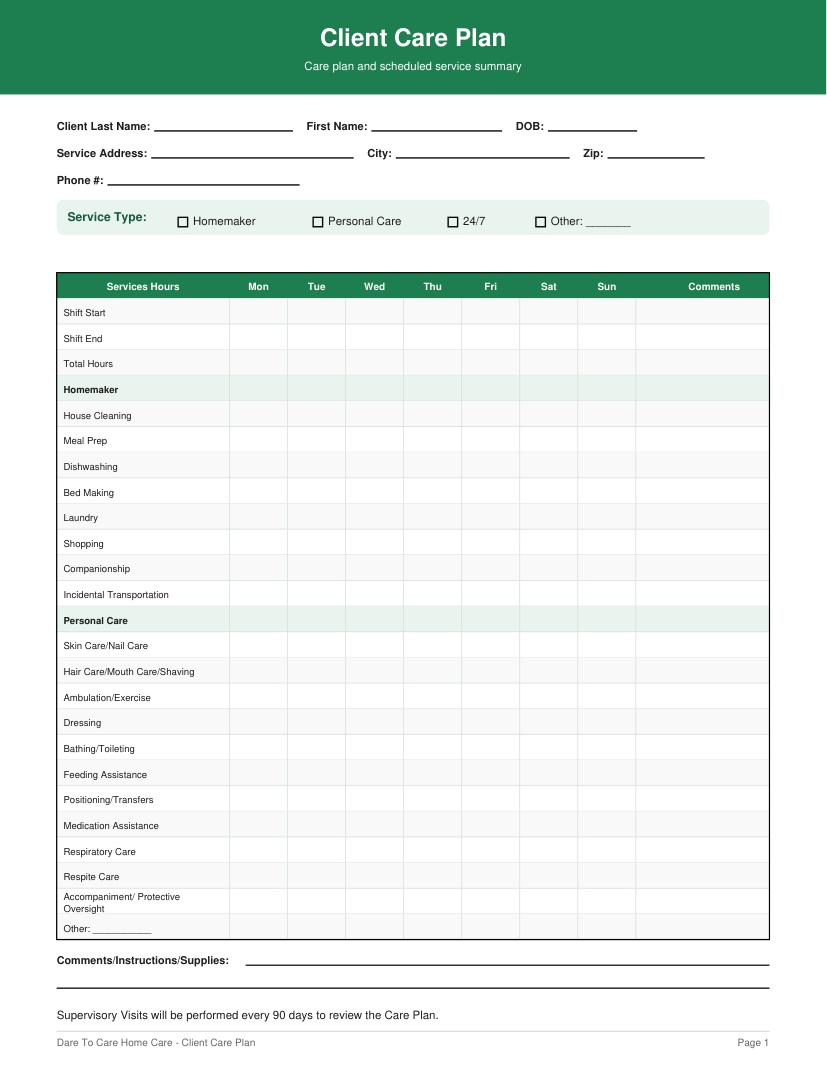
Document layout with clear section breaks, labels, and usable field spacing.
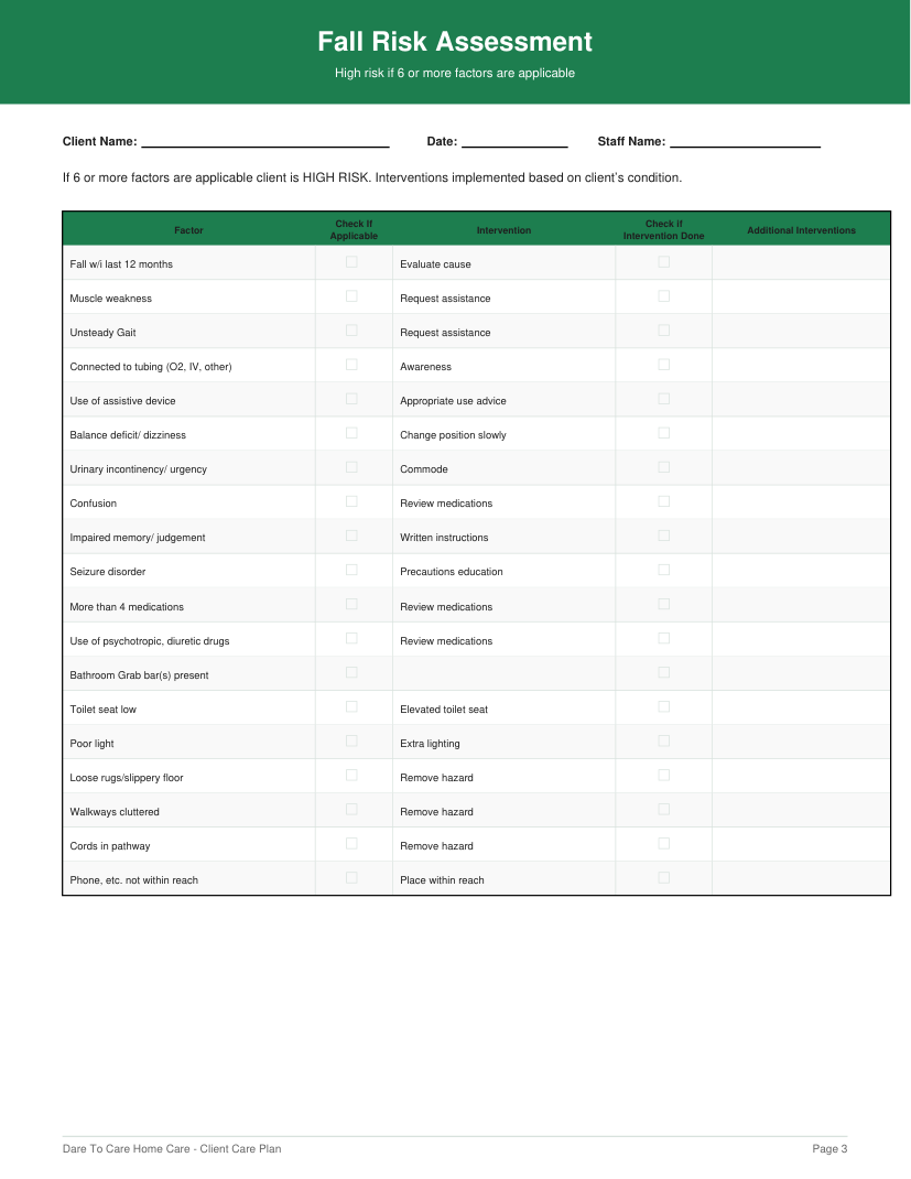
Multi-section form showing information grouping and visual hierarchy.
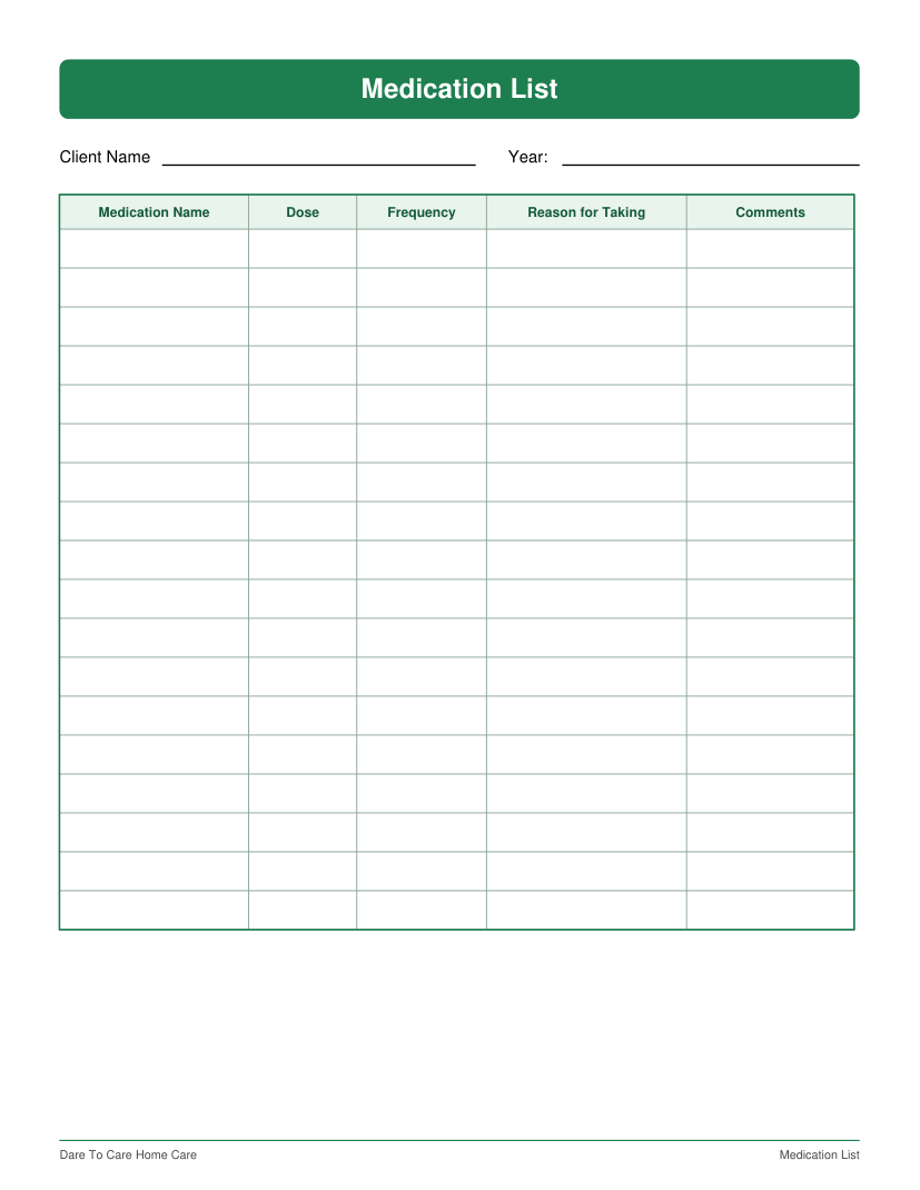
Practical document design with structured table layout and admin-ready formatting.
Poster design, photo editing, and other selected works from the broader practice.
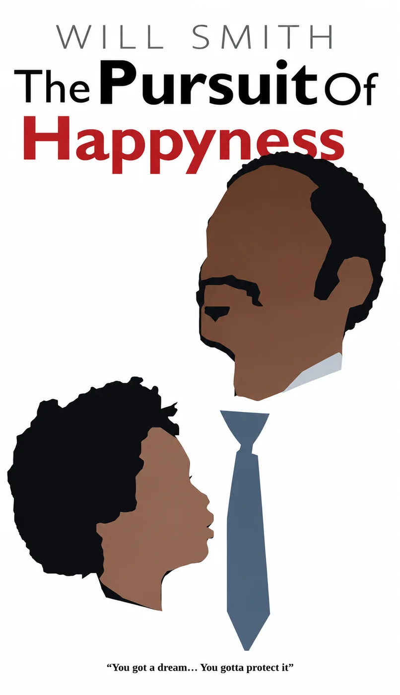
Fan movie poster design created around 2019. Typography, color, and composition built from the source material.
All artwork, photography, designs, sketches, and written content are protected. Do not copy, repost, trace, sell, scrape, or train AI on without written permission. © 2026 R-EqualsMe.